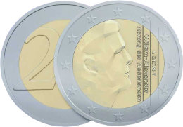
Erwin Olaf’s euro coin criticized for cheap typography
 Erwin Olaf is a kick-ass photographer, but does that make him a good coin designer? The Netherlands do have to uphold a reputation in this respect.
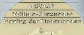
When Willem-Alexander became king of the Netherlands the need arose to design new coins. The job was given to Mr Olaf this time around. He seems to have done a respectable job, except for the lettering. Fonts In Use says: “It’s highly questionable whether such a bold wide retro-futuristic letterstyle in mixed case is suited for the medium and the topic—and whether it had to be a font (as distinguished from custom lettering) in the first place.”

The alleged lettering.
The choice for an off-the-shelf type is also remarkable when contrasted with the fact that the country “today has more type designers per capita than any other country in the world, a remarkable fact considering that there is now not one surviving Dutch type foundry”, typographer Gerard Unger is quoted as saying on Typotheque.
See also:
- First ever coins with QR codes issued are Dutch
- A design history of the guilder coin
- Geeked out coin wins design comp
(Illustrations: Fonts In Use)

Leave a Reply