June 17, 2018

This slab H sprouts serifs until it no longer can

Filed under: Art by Branko Collin @ 10:23 am

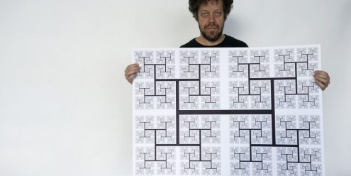
Typographer Just van Rossum used his brother Guido’s programming language Python to create a capital letter H in which each serif (the dangly bits at the ends of the stems) sprouts its own serifs, creating a recursive H in the process.

Typotheque in The Hague made a limited edition poster of this design:

Slab serif typefaces are characterised by angular terminations at the end of strokes. Just van Rossum designed this ultimate Slab Serif capital H, with an ever-expanding number of serifs. Each H has four serifs, each of which becomes an H by sprouting additional serifs.The serifs on those serifs sprout their own serifs, on and on and on up to the thinnest line that offset press technology can handle.

See also: Geeked out coin wins design comp for another example of Python-based algorithmic art.

(Photo: Typotheque)

Tags: , ,

June 21, 2015

Henry the sign painter (video)

Filed under: Design,General by Branko Collin @ 11:43 pm

henry-sign-painterHenry van der Horst from Zeewolde hand letters signs for outdoor markets all over the Netherlands.

Two graphic designers met him while he was out working and partnered up with him last year. They built a website to sell his signs (his “5 Euro Super Deal” costs 39 euro) and created the video above (subtitled in English). Check also another video of Van der Horst creating a magazine cover.

(Link: Trendbeheer; photo: crop of a screenshot of the video)

Tags: ,

November 4, 2013

Erwin Olaf’s euro coin criticized for cheap typography

Filed under: Photography by Branko Collin @ 2:35 pm

Erwin Olaf is a kick-ass photographer, but does that make him a good coin designer? The Netherlands do have to uphold a reputation in this respect.

When Willem-Alexander became king of the Netherlands the need arose to design new coins. The job was given to Mr Olaf this time around. He seems to have done a respectable job, except for the lettering. Fonts In Use says: “It’s highly questionable whether such a bold wide retro-futuristic letterstyle in mixed case is suited for the medium and the topic—and whether it had to be a font (as distinguished from custom lettering) in the first place.”

The alleged lettering.

Mr Olaf used a free font he found on the web called Days, which is according to a commenter over at Fonts In Use “a display typeface meant for use in large sizes.”

The choice for an off-the-shelf type is also remarkable when contrasted with the fact that the country “today has more type designers per capita than any other country in the world, a remarkable fact considering that there is now not one surviving Dutch type foundry”, typographer Gerard Unger is quoted as saying on Typotheque.

See also:

(Illustrations: Fonts In Use)

Tags: , , , , ,

September 10, 2012

Will Amsterdam Central Station be ‘kerned’ correctly?

Filed under: Architecture by Branko Collin @ 9:18 pm

Amsterdam Central Station is getting a new bus terminus, and architects Benthem Crouwel have decided to adorn the terminus’ roof with the word ‘Amsterdam’ in giant red glass letters.

Famous Dutch graphic designer Piet Schreuders is worried that the letters may not be spaced correctly (kerned, as typographers call it), and watches the roofing process like a hawk, sharing his observations at Typographica.org.

Today, in September 2012, the middle section of the roof is still missing, so all we can see is AM…RDAM. (The letters STE won’t be inserted until 2013, when construction of the underground North-South tram line at this location is expected to be finished.)

Being worrisome by nature, we typographers can’t help expressing some concerns: did the architects and roofers calculate everything exactly right? Will the missing letters fit into the remaining space? And did the roofers adhere to proper kerning specifications?

Fact: the word AMSTERDAM starts and ends with the letter combination AM. The first worrisome fact: the space between the first A and M is five windows … but between the second A and M—oh, horror—it is only four.

Earlier this month the Rijksmuseum Amsterdam presented its new logo which had too much space in it, right at a position that suggested a case of ‘English disease’, as the Dutch call it—the habit of putting spaces in compound words. That space caused a lot of buzz on the Internet—I doubt Benthem Crouwel’s typography will yield a similarly rich word of mouth.

(Illustration: Benthem Crouwel Archtitects)

Tags: , , , ,

June 3, 2007

Still waiting

Filed under: General by Orangemaster @ 9:43 am

I used to work at a factory that made these things, albeit not in Dutch.

The sign should read Groenburgwal, and so has an ‘r’ too many. Hope it was free.

This is akin to finding a four-leaf clover (and ‘groen’ means green).

‘Still waiting’ refers to the fact that the sign has now been removed and we’re all waiting for the corrected version (see link).

groen1.jpg

(Link: A5, Photo: Herenlunch)

Tags: , ,