24 Oranges goes mobile
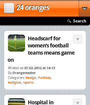 Starting today 24oranges.nl has a mobile version of its website.
You can access this version using the same address as always. The mobile version is much leaner and is optimised for small screens. We use the very popular WP Touch plug-in for this.
If you are reading this on a mobile device and still see the old design, tell us which device you are using in the comments and we’ll see what we can do. The desktop version of this site should work well on tablet-sized screens and bigger, while the mobile version is intended for phone-sized devices.
Personally I prefer non-mobile views from my mobile devices. That said, in a quick test just now from my phone, I was able to switch “off” the mobile version so that I could see the site normally. My phone seems to be remembering the preference.
This is a constant nuisance for me because in my opinion normal sites are typically the ones that look best. If I just want the raw content on my phone I can use straight up RSS, or apps that download RSS feeds.
But if I want the site, I want the site. Not a bootleg. That’s me though, my opinion, and I don’t claim to be in the majority.
I’m guessing that mobile versions of sites won’t have much of a need for existing in a year or two (basically now the only need is crappy phones that have trouble displaying normal websites).
I like that you’re working on the site, though, 24 always gives me something to think about and I will keep reading. Keep up the good work!