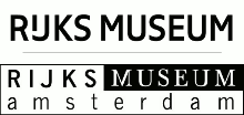
Rijksmuseum purposely misspells name in new logo

The new logo and the old logo.
Oddly enough, the name is spelled “Rijks museum”, which is not correct according to the official Dutch spelling. As one commenter at Bright asked, who is Rijk and why does he have his own museum?
The designer, Irma Boom, explains that the space is on purpose: “Everybody is already using Rijks as a pet name for the museum”—her spelling merely codifies and pays homage to that practice.
Bright also links to a profile about Boom which is a must-watch for its opening sentence alone, “I hate hand-made books”, which runs completely counter to today’s idolization of all things artisanal.
Meldpunt Spatiegebruik, which collects examples of the misuse of spaces in compound words, writes: “Never have I received so many reports about a single space within half a day. But the Rijksmuseum belongs to all of us, so you can’t touch it.”

[…] the Dutch call it—the habit of putting spaces in compound words. That space caused a lot of buzz on the Internet—I doubt Benthem Crouwel’s typography will yield a similarly rich word of […]
[…] Rijksmuseum (or Rijks Museum) in Amsterdam, home to many a Dutch master, has been partially closed to the public for renovations […]
[…] Rijksmuseum in Amsterdam decided to adopt the improper use of a space between words and go with Rijks Museum, which was ‘designerplained’ as “everybody already says ‘Rijks’ as a […]