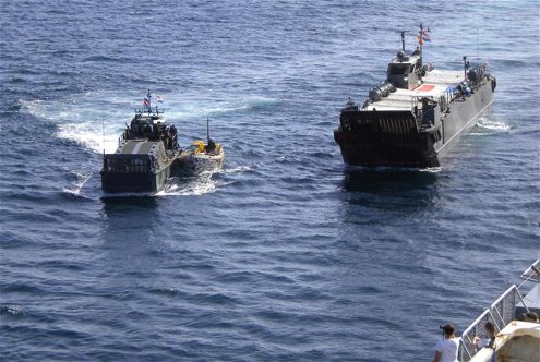
Hr.Ms. Johan de Witt has captured two so-called whalers off the Somali coast last week. Whalers are “pirate motherships,” as Radio Netherlands says they are called, forward operating bases from which other pirate vessels are launched.
By using the troop transporter Johan de Witt, the Dutch navy is mimicking the pirates’ tactics: using a forward operating base from which to launch small vessels, in this case landing craft.
(Note the Obama flash light on the pirate vessel.)
![]() By the way, what do you think of the ‘new’ logo (2000) of the Ministry of Defence (right)? On the one hand I feel it is boldly modern, on the other hand it doesn’t have the don’t-mess-with-us quality that the lions, eagles, swords and shields of yesteryear had. Bold, in other words, but the wrong kind of bold.
By the way, what do you think of the ‘new’ logo (2000) of the Ministry of Defence (right)? On the one hand I feel it is boldly modern, on the other hand it doesn’t have the don’t-mess-with-us quality that the lions, eagles, swords and shields of yesteryear had. Bold, in other words, but the wrong kind of bold.
(Source photo: Ministry of Defence. In the photo one of the whalers is brought in by a landing craft.)