October 18, 2018

Spijkenisse unveils Silly Walks pedestrian crossing

Filed under: Weird by Orangemaster @ 12:50 pm

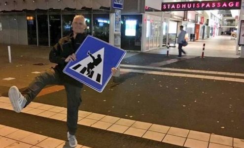
Spijkenisse, South Holland, the city of the fake euro bridges, has officially unveiled a special pedestrian crossing sign at city hall today, featuring none other than a nod to John Cleese as the Minister of Silly Walks in the famous Monty Python sketch of 1970. The sign depicts a man wearing a bowler hat and carrying a briefcase who is about to take a funny step to cross the street.

A local bureaucrat heard about a similar sign in Haparanda, Sweden, and as a fan of British humour figured why not have such a sign in Spijkenisse as well. And since according to him weird things happen at city hall, having the sign next to his place of work was fitting. Crossing the street at one of the city’s busiest intersections with a smile is also a good idea. And regardless of how funny your walk is, traffic still needs to stop for you.

Back in 2016 we told you about hundreds of fans of British comedy legend John Cleese showing up for the opening of a Silly Walks tunnel in Eindhoven.

(Link and phote: nos.nl)

Tags: , , , ,

September 2, 2014

Touring the euro bank note bridges in Spijkenisse

Filed under: Architecture by Orangemaster @ 11:36 am

Bridges1

In 2011 we reported about pedestrian bridges resembling euro bank notes in Spijkenisse near Rotterdam and that they would be built at the same time as the neighbourhood they connect to downtown Spijkenisse.

The fictional bridges were designed by Austrian engraver Robert Kalina while the real bridges were designed by Dutch designer Robin Stam. The neighbourhood is still being built, but the six bridges are all there. Read on to find out why there are only six bridges although there are seven bank notes.

I happened to be working at the Spijkenisse Festival this year, which was held next to the new area. As I toured the grounds with my morning coffee, I noticed a bright yellow bridge. I looked around and saw some more coloured bridges, then realised I was staring at the ‘euro bridges’.

Below are photos of all the bridges which I took with a smartphone between two rain showers. Apparently the Japanese have a thing for these bridges, hence the prominence of Japanese on the sign (above).

On the far left of the neighbourhood there’s the 500, the 50 and the 10 bridge, and half a kilometre away on the far right of the area there’s the 100, the 5 and 20, and the 200.

5euro-good

20euro-good

The bridge depicting the 5 euro note has the bridge of the 20 euro note on the other side, the only bridge with a dual function. The 5 comes close to its grey bank note, and the blue is brighter than its legal tender counterpart.

10euro-good

The 10 euro bridge is more burnt sienna coloured than red, but it looks nice that way.

100euro-good

The green of the 100 is subdued. Since most shops don’t accept anything more than 50s, I don’t see 100s very often as they are inconvenient.

200euro-good

You can’t miss this yellow bridge depicting the 200, which stands out from the rest.

500euro-good

The 500 bank note bridge reminds me of the Martinus Nijhoff cable bridge near Zaltbommel, Gelderland, but magenta.

Tags: , , ,

June 18, 2011

Two hundred euro note bridge to become pedestrian crossing in Spijkenisse

Filed under: Architecture,Art,Design by Branko Collin @ 2:22 pm

As we wrote a couple of days ago, Robin Stam is making real bridges of the fictional ones you can find on the euro banknotes. His playground is a new neighbourhood in Spijkenisse near Rotterdam (bordering the Oude Maas river) called ‘t Land (the Land), which is still very much under development.

Robin gladly answered a few of our questions:

The first two bridges are almost finished, and the rest will be built in sync with the realisation of the neighbourhood.

The properties are sold in shifts, so unfortunately it will take a while for the project to be completed. The first two bridges will be ready at the end of September. The drawings and calculations for the other bridges are almost done. The way things are looking now the 200 euro bridge will be built at the start of next year. This will become a small pedestrian bridge, built exactly like on the banknote, meaning that the scale will be completely out of proportion.

Mark van Wijk, Joeri Horstink and I are working on a number of projects under the label Rotganzen. Currently a project of ours that is getting a lot play in the blogosphere is Party, about stylized broken party tents.

Completely off topic: an exhibit of big party tents in Dutch would be called an ‘evenementententententoonstelling’. I’d like to see other Germanic languages come up with compound words like that. I bet you cannot! I bet you are too scared!

Tags: , , , ,

May 31, 2009

Tower of books for Spijkenisse signed MVRDV

Filed under: Architecture by Orangemaster @ 12:02 pm

book-mountain-by-mvrdv-6mvrdv_tp230_spijkenisse-bijpg

It’s time to write more about Dutch design firm MVRDV now that Rotterdam, as well as the nearby city of Spijkenisse, where this library is to be built, are getting architectural makeovers.

Completion of the building is scheduled for fall 2011. With a surface of 10,000 m2, this public libray will be an example of energy efficiency and advertise reading through its design of a book mountain. In addition to the book collection and reading areas, the library will accommodate commercial facilities, offices, an auditorium, conference rooms, and exhibition spaces.

Let me see:
– I have problems with the fact that direct sunlight is hitting books, although there is talk of solar protection. Probably a normal response.

– Call me politically correct, but all that climbing for the elderly and the likes got my attention. Again, I could be wrong, but that is more often than not a problem in the Netherlands.

– I do like the Dutch ‘obssession’ with showing the insides of buildings (the Muziekgebouw aan het IJ in Amsterdam came to mind). I once read that even showing the insides of canned foods worked well in the Netherlands.

– The whole Library of Alexandria meets Louvre Pyramid “in traditional Dutch barn yard style typology” needs some getting used to. Apparently, the shape and choice of materials is a reminder of the agricultural history of Spijkenisse, “now a suburban area of Rotterdam with statistically a low average of readers.” Politely put, it’s full of low income families who just don’t read (or can’t) and couldn’t care less what their ‘burb of Spijkenisse used to look like.

So yes, please build these folks a nice public library. Right on.

(Link and photo: dezeen.com)

Tags: ,