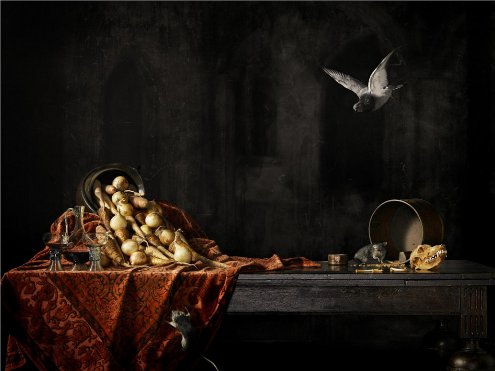
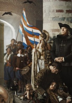
 Look at these great photos Erwin Olaf made in celebration of the liberation of Leiden from an 11 month siege by Spanish forces in 2011.
The city still celebrates the liberation each year. Olaf made nine photos on request of Leiden University (the oldest in the Netherlands) and Museum De Lakenhal, some of them portraits, other still lifes. The largest, a historical ‘painting’, is on permanent display in De Lakenhal, the other eight are exhibited until January 8 in the university library. The photos are inspired by paintings of the time.
You can also view the photos at a digital exhibit of the University of Leiden:
The historical piece was shot on July 6, 7 and 8 in Peter’s Church in Leiden. The equipment had been installed on the fifth. On that same day Olaf took a test photo using stand-in models. He had picked the camera angle during an earlier visit to the church. […] The photo was shot in three parts, spread out over the three shooting days. First the right hand side, then the middle, and finally the left hand side.

NRC has a short ‘making of’ picture gallery.
Erwin Olaf is a former journalism student who quickly turned to art and commercial photography. He gained fame and notoriety with his portraits of fat people and midgets in bondage outfits. On October 13 he will receive the Johannes Vermeerprijs, a state award founded in 2008 to “honour and further stimulate remarkable talent”. The award consists of 100,000 euro.
Leiden was liberated in 1574 by the terrorists of Willem van Oranje, the so-called geuzen or gueux. The French word means beggars, a name given to the Dutch nobles that wanted to separate from Charles V’s European empire. The geuzen breached dikes around the city, after which the Spanish army fled. A young orphan called Cornelis Joppenszoon left the city on October 3 and went to a Spanish army camp, which he found deserted. There he also found a kettle containing hutspot (mashed potatoes, carrots and onions). He then alerted the citizens. In the early morning the geuzen entered the city bringing herring and white bread.
Using water as a defense was seen as a viable way to maintain Amsterdam as a national redoubt until the invention of the tank. The floodable area was called Fortress Holland.
Not unrelated: Modern still lifes by Richard Kuiper.
(Photos: Erwin Olaf, 2011, Leidens beleg en ontzet (1574). Link: Historiek.net. Link tip: the Digital Diva.)
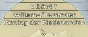
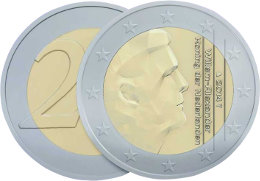 Erwin Olaf is a kick-ass photographer, but does that make him a good coin designer? The Netherlands do have to uphold a reputation in this respect.

 Look at these great photos Erwin Olaf made in celebration of the liberation of Leiden from an 11 month siege by Spanish forces in 2011.