Van Gogh’s paintings as shot by amateur photographers
The Wiki Loves Art contest that I reported about earlier is over, and all that is left is for the judges to declare a winner.
One of the extraordinary things about this contest is that the Van Gogh museum in Amsterdam opened its door to amateur photographers. That must have been a frightful decision to take, what with all the paintings worth millions just a camera stand leg away from scratching, so I hope it was a good experience for them.
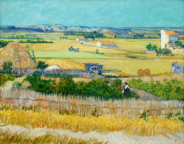
Painting above is The Harvest (1888), photo taken by Flickr user Pachango. View the 4,500+ contest photos here, or just the 450+ Van Gogh ones here. (I edited the colours into oblivion, but I just could not agree with the red hue that Pachango’s version had, or the yellow hue on the museum’s website.)
Hi Branko,
I used a grey card in the pictures I took at the Van Gogh Museum and colour corrected them during processing with the grey card as reference. So their colours should be rather close to the real thing.
I worked from the assumption that the surrounding wall was supposed to be grey or white. But if there is a reddish hue in the wall’s paint, then your processing has correctly captured that hue. :-) There’s also a slight dark-light gradient in the wall’s colours.
Thanks for the added info. I hope you had fun at the Van Gogh. You made some very good pictures.
Thanks, I had a lot of fun! It was truely a unique oportunity: only a couple of guards and a small group of photographers quitely clicking away, no other visitors. A lovely way to visit the museum, not only for taking photos but also to enjoy the paintings.
The museum rooms are lit from above with tempered daylight and in some cases from the sides by the windows that are covered with softening white sheets. Plus there are lamps (halogen I believe) directed on the paintings from the ceiling. That makes for a challenging combination of natural and artificial light: hard to get the colours exactly right even with a grey card. And it causes the gradient in the wall’s colours.
Plus don’t forget the fact that everybody will be looking at the photos using different monitors and different colour profiles, so it will always be better to just go experience the painings in the museum than to look at them on your computer. I hope that my pictures will accomplish just that: they’re good enough to get people excited about the art, but not good enough to match the real thing. So go to the museum everyone!
Oh and an extra complicating factor: the walls have different colours. This painting of a crab, for example, is hanging in a corner:
The wall right next to it is terra cotta coloured, as you can see below. That will undoubtedly have influenced the shade of the light falling on the crab.
Hm inserting images into my comment didn’t work, apparently.
Crab’s here: http://farm4.static.flickr.com/3599/3682955424_b4faaa11a0_m.jpg
Terra cotta wall is here: http://farm4.static.flickr.com/3538/3682143695_902cf06862_m.jpg
[…] earlier similar and very successful event was called Wiki Loves Art, and was held in June 2009, resulting in about 5,000 Creative Commons licensed photos. That the […]