May 27, 2008

Cargo bike with 8 seats for children

Filed under: Bicycles,Design by Branko Collin @ 8:00 am

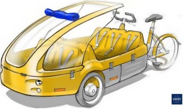
This cargo bike (bakfiets) concept seats eight children and a hapless grown up who has to somehow keep an eye on that merry bunch and pedal too. Luckily for the cyclist, an electric helper motor is part of the plan, which was thought up by amongst others Henny Grave from Deventer (Dutch) and Gazelle’s Van der Veer Designers.

The design was originally born as part of a project to help parents fetch children after school. Grave has bigger plans though, and hopes to transport the elderly from and to the railway station with this bike, tourists around town, and garbage to wherever garbage needs to be.

Source sketch: Van der Veer Designers. Via Dagelinks (Dutch).

Tags:

May 25, 2008

Knitted sausage at MAMA

Filed under: Art,Design,Food & Drink by Branko Collin @ 3:15 pm

Here, have some knitted sausage:

Proef founder Marije Vogelzang is exhibiting these knitted sausages amongst others at her first (and perishable) solo exhibition at the MAMA showroom in Rotterdam. Proef is two food design studios / restaurants in Rotterdam and Amsterdam.

(“Proef”, pronounced proof, is the imperative of to taste, or as a noun means test. Two languages separated by the North Sea.)

Photo by Proef. Via Trendbeheer (Dutch).

Tags: , , ,

May 14, 2008

Miffy and the village marketing scheme

Filed under: Design by Branko Collin @ 10:21 am

A little over 50 years ago Miffy, one of the Netherlands’ biggest export ‘products’, was introduced to the world by her creator Dick Bruna in a book that described how she lived in the dunes of Egmond aan Zee. The village now wants to turn itself into a “Nijntje” village (Dutch for Miffy and pronounced somewhere between NAYN-CHE and NINE-CHE). To do this the village association will place direction signs with a Miffy motif on the beach, and will build a Miffy boat that will be placed on the Nijntje aan Zee Pleintje. The latter is a pun, for “pleintje” is the diminutive of “plein,” square. The city of Utrecht already has a Nijntje Pleintje which was designed by Bruna’s son Marc.

The Nijntje aan Zee Pleintje will be located at the main beach entrance. The boat will be a pinck, a type of flat-bottom fishing vessel that was developed locally and used from the 17th through the 19th century when it stopped being competitive.

Via webregio.nl (Dutch). Source image: nijntje.nl.

Tags: , , , , , , , ,

May 13, 2008

Designer clogs from the antipodes

Filed under: Design by Branko Collin @ 8:30 am

Lola Granola submitted this story:

“Check out these nifty designer clogs. The Cadillac and bridal “klompen” are to die for!”

Don’t hesitate to wander around Amsterdam-born, New Zealand-based designer Patricia van Lubeck’s website to discover her other wonderful art.

Thanks Lola!

Tags: , ,

May 3, 2008

Bike safety made hip with Bastiaan Kok’s camouflaged helmet

Filed under: Bicycles,Design by Branko Collin @ 11:07 am

The Netherlands is a country of bicyclists but by stark contrast (or perhaps because of that) helmets are not obligatory here. Designer Bastiaan Kok tries to remedy a distaste for helmets by coming up with a helmet that doesn’t make you look like you’re wearing a helmet. Covered to look like a cap or a hoodie ornament, the helmet quietly disappears against the backdrop of your backpack when not worn.

Kok’s design won first prize in a road safety contest by Vredestein, a Dutch tire manufacturer. Second place went to saddle bags with safety wheels for the elderly by Flip Ziedses Des Plantes, and third place to a dashboard cutesy animal by René de Torbal that tells you when you’re driving your car safely and when not.

Via Bright (Dutch).

Update: Read these fine posts (here and here) by Tobias Sterling on the meaning of bike safety in the Netherlands.

Tags: , ,

April 28, 2008

WirePod by Joris Laarman

Filed under: Design by Orangemaster @ 2:44 pm

wirepod1.jpg

Live from Milan: American brand Artecnica has launched WirePod, a multi-point electrical “power pod” designed by Dutch designer Joris Laarman.

Made of thermoplastic rubber and with four plug outlets, the 3.8 metre long products is the first in a series of Artecnica products called Wiremore, which will make electrical cables more, rather than less, visible.

There’s more pretty pictures if you follow the link.

(Link: dezeen.com)

Tags: , ,

April 27, 2008

Play dough-like furniture by Maarten Baas

Filed under: Design by Branko Collin @ 2:37 pm

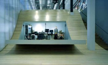
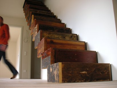
Eindhoven-based designer Maarten Baas presented prototypes for Chankley Bore, a line of furniture to be sold by UK firm Established and Sons. The photos in Dezeen Magazine show play dough-like lamps (?) and cupboards (?) with some mighty weird extensions.

Baas is a designer who uses actual clay to make furniture, and has a few other interesting projects in his portfolio.

Illustration: Established and Sons.

Tags: , , ,

April 23, 2008

Rem Koolhaas to design Prada museum

Filed under: Architecture,Design by Orangemaster @ 8:37 am
prada1.jpg

Dutch architect Rem Koolhaas has been asked to design a museum for Prada’s art collection, according to the website of Office for Metropolitan Architecture (OMA), Koolhaas’ architectural firm.

Designer Miuccia Prada and her spouse Patrizio Bertelli have bought hundreds of modern art pieces over the years and need a place to display them. They have found a place in Milan where Koolhaas is going to design three new buildings, including a tower with exhibition halls. Koolhaas has already designed the Prada flagship store in New York City (see photo).

(Link: gelderlander.nl)

Tags: , , ,

April 17, 2008

Stairs made from a castle’s floorwood

Filed under: Design by Branko Collin @ 10:41 am

Recycled furniture – furniture clearly made from recycled materials – got very popular in the Netherlands sometime in the 1990s when an artist found out that a regular cupboard made from new materials would easily net multiple times the price if made from recycled wood. Despite the over-saturation of this market I like this staircase made by Jan Korbes from the Hague by turning old floorboards of Schloss Wiesenburg (Wiesenburg Castle) in Germany into boxes.

Via BoingBoing.

Tags: , , , ,

April 11, 2008

I amSterdam, Madrid is mad

Filed under: Design by Branko Collin @ 11:41 am

You can say many bad things about Amsterdam’s city marketing campaign I AmSterdam, but at least in some respect it works. A mix of the phrase “I am Amsterdam” and “I heart Amsterdam,” the slogan lets people express their positive feelings towards the city in a tacky but unified manner.

Madrid tries to copy the formula, and copies everything that is wrong about the I AmSterdam campaign. It is tacky. You cannot force a meaningful emotional response with a cold marketing campaign. The formula replaces core values—the reasons why people like Amsterdam or Madrid—with empty slogans. And in doing so, the campaigns are insulting to their audiences’ intelligence.

But Madrid’s copy takes things one step further: it just doesn’t work. “Madrid about you” is a funny pun, but the way the logo is styled makes it say: “Madrid equals mad” (the “about you” is de-emphazised by shoving it to the bottom and printing it in a smaller font.) Critical Spanish designer Rafa Celda says in El Pais that the people who came up with this campaign are trying too hard. “This is like one of those logos that comes with a manual.”

Via Nieuws uit Amsterdam (Dutch). Photo by Matt Rubens, distributed under a Creative Commons Attribution-Share Alike 2.0 license.

Tags: , , , , ,